CASE STUDY — Enterprise UX Strategy
Making a complex enterprise platform faster, simpler, and easier to use.
I connected research, navigation redesign, workflow improvements, and operational data into one experience strategy for Adobe DPO, a Microsoft Dynamics 365-based platform used across Professional Services.
UX STRATEGY
DATA VISUALIZATION
ENTERRISE DESIGN SYSTEM
RESEARCH
DYNAMICS 365
INFORMATION ARCHITECTURE
POWER BI
at a glance
A case study about turning disconnected UX requests into a system-level strategy.
200+
survey responses synthesized
20+
interviews and working sessions
~25
navigation items identified for removal or deprioritization
3
connected experience pillars
Focus: research → strategy → architecture → prototype → feasibility
Role: Principal Experience Designer / UX Strategist
01 — Overview
This was more than just a dashboard project.
I addressed multiple user needs—including better navigation, simplified workflows, and actionable data—by creating a unified experience strategy for the DPO platform.
Role
Principal Experience Designer / UX Strategist
PLATFORM
Microsoft Dynamics 365 + Power BI
AUDIENCE
Project, Resource & Revenue Operations
Research, strategy, IA, prototyping, feasibility
CONTRIBUTION
Users had to learn the system before they could work effectively.
How can we redesign the platform to support user workflows instead of forcing people to learn the system's structure?
The DPO platform was organized around system functions rather than user needs. Navigation was cluttered, data was scattered, and workflows were complex. Despite these features, user adoption remained low.
02 — CHALLENGE
Cluttered Navigation
01
Simple tasks required too many steps, and users had to memorize where specific tools were located.
02
Complex Organization
Workflows were inconsistent, making it difficult for users to find and complete daily tasks.
03
Scattered Data
Users had to pull information from multiple reports just to understand which actions they needed to take.
04
Complex Processes
Research confirmed that data visibility alone wasn't enough; the platform remained difficult to navigate and use.
03 — Research & synthesis
I looked for patterns across the platform, not isolated complaints.
The research program combined survey data, interviews, workshops, card sorting, and prototype feedback. My job was to translate a large volume of input into decisions the product and engineering teams could actually use.
200+
survey responses helped expose recurring themes across roles and workflows.
Users expected common interactions to respond quickly enough that the platform did not interrupt the work itself.
Performance
20+
interviews and working sessions
The growing number of links, views, subgrids, lookups, and pathways increased cognitive load.
Simplification
3
dominant experience themes
Users needed too much system knowledge before they understood where tasks belonged.
Onboarding & Training
1
shared experience direction
04 — Navigation strategy
The breakthrough was a shift from entities to activities.
Users thought about responsibilities as work to accomplish. DPO organized that work as system objects. I translated the research into a task-based information architecture that better matched users' mental models.

05 — Applying the strategy
Revenue Operations needed a decision-making experience, not another report.
The Revenue Operations Dashboard became the clearest example of how the broader strategy could work in practice. The experience was designed around three questions: Where is there risk? What requires action? What should I address first?


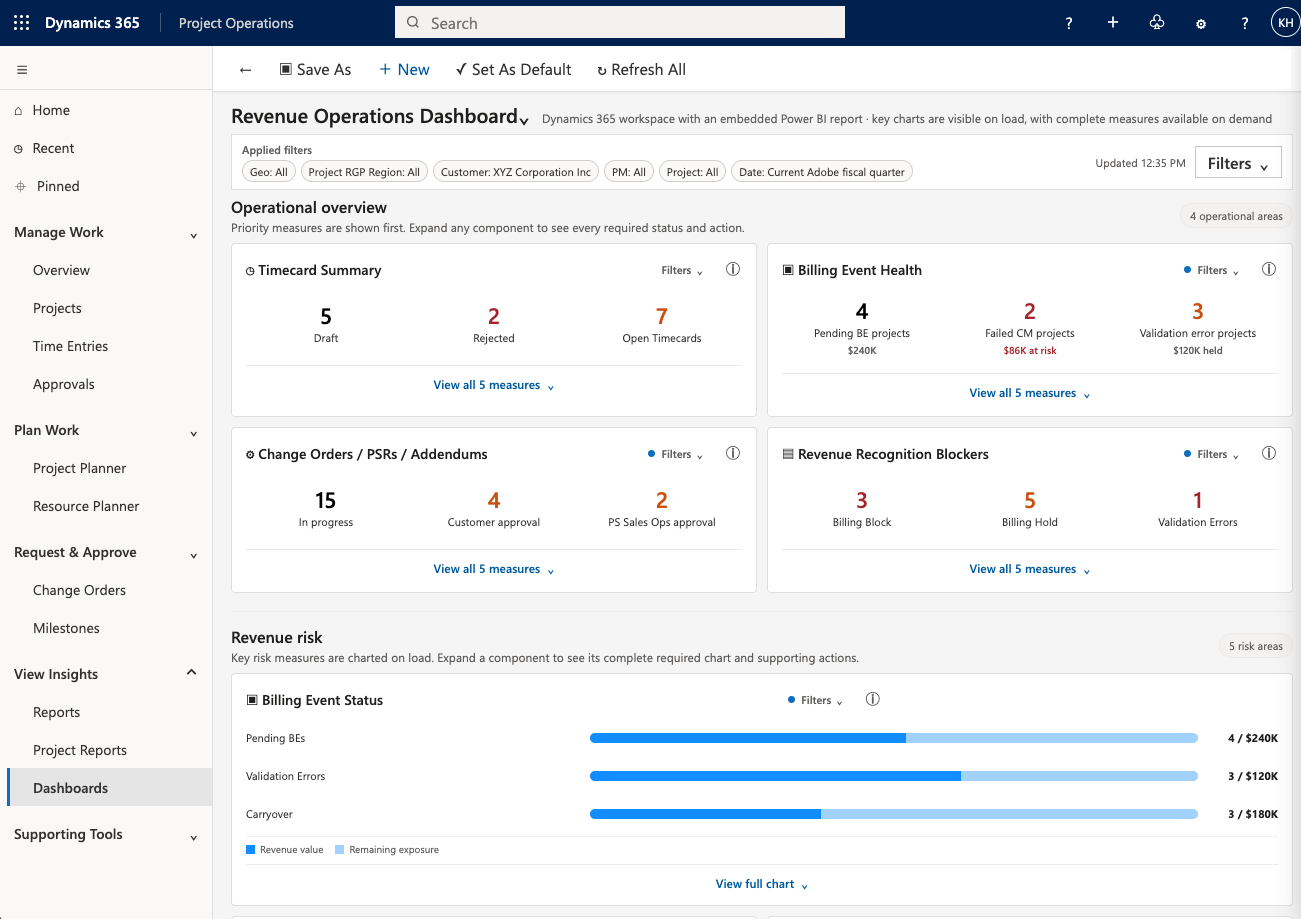
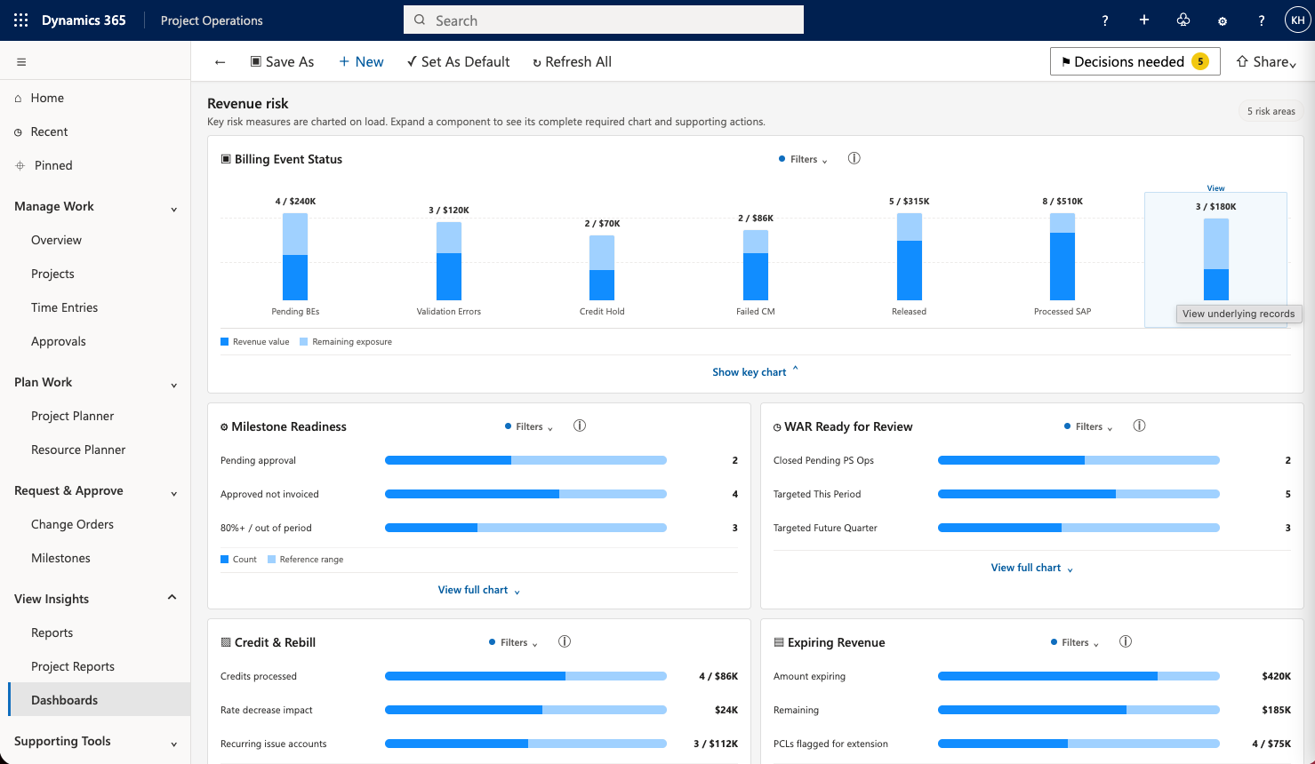
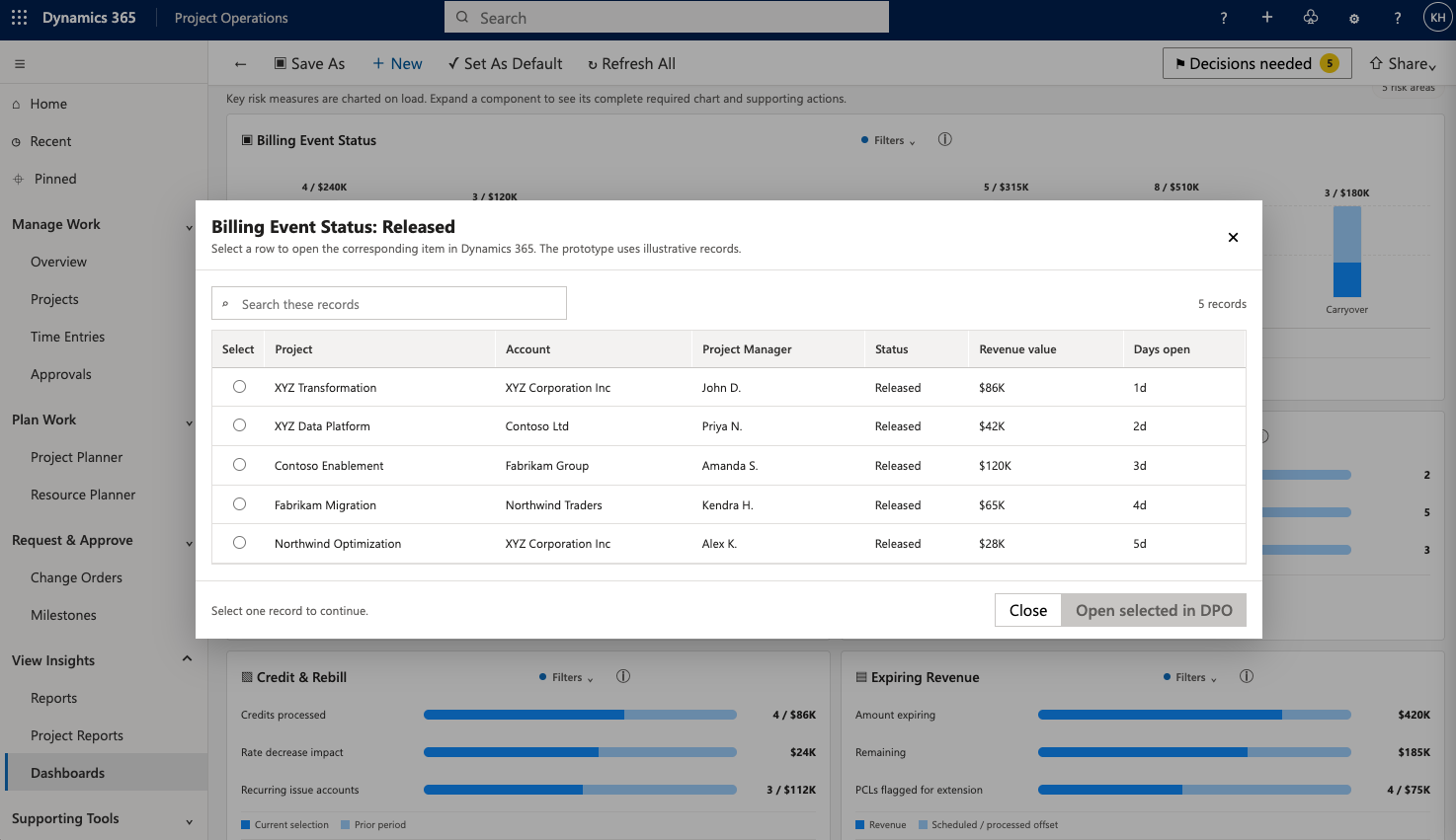
Portfolio note: this visualization uses sanitized example data and a recreated interface to demonstrate the design approach without exposing proprietary information.
DECISION #1
Progressive disclosure
Instead of solving clutter by hiding everything behind tabs, the page surfaced a focused default view and allowed deeper exploration when needed.
Charts stay visible
DECISION #2
Feedback showed that users valued visualizations, so the strongest charts returned to the default experience while lower-priority detail remained expandable.
Actionable states
DECISION #3
Clickable counts, clear blockers, approval states, and targeted detail turned passive reporting into an operational work surface.
06 — Engineering collaboration
Technical feasibility was part of the design process.
Power BI integration changed the nature of the problem. We had to determine what could realistically be delivered through the combination of DPO, Dynamics 365, and embedded reporting. I worked with engineering and Power BI partners as concepts evolved instead of treating feasibility as a final handoff step.
Dynamics 365 / DPO
Existing workflows, navigation patterns, data relationships, and enterprise interaction conventions.
Experience Strategy
Filtering, prioritization, progressive disclosure, interaction patterns, information hierarchy, and workflow continuity.
Power BI
Operational reporting, charts, risk indicators, drill-down behavior, and embedded analytics feasibility.
07 — System-level strategy
The goal was a reusable experience model, not a collection of fixes.
The same principles applied to navigation, the Revenue Operations Dashboard, Change Order workflows, and future DPO enhancements. That created a more coherent product direction across initiatives.
Surface what matters first
Use hierarchy to separate immediate action from supporting detail.
Design for density
Complex systems do not always need less information. They need better prioritization.
Reduce unnecessary decisions
Make defaults, labels, and pathways reflect the user's task.
Keep detail available
Progressive disclosure preserves expert depth without overwhelming the initial experience.
Use familiar patterns
Stay aligned with enterprise design conventions instead of adding unnecessary custom behavior.
Make constraints visible early
Treat technical limitations and implementation realities as design inputs.
08 — Outcome
The work established a shared direction for a simpler, more actionable DPO.
Research moved the conversation away from isolated requests and toward a broader understanding of how navigation, workflow complexity, reporting, and platform performance affected one another.
Navigation strategy
Created a task-based model that better reflects user intent.
Revenue Operations vision
Defined an integrated Power BI + DPO experience focused on risk and action.
Reusable design principles
Established interaction patterns that could extend across multiple workflows.
Cross-functional alignment
Gave product, business, and engineering teams a shared experience direction.
What this case demonstrates
Enterprise complexity
Interconnected workflows, roles, systems, and operational needs.
UX strategy
Research translated into principles that influenced multiple initiatives.
Information architecture
Shifted navigation from system entities toward task-based mental models.
Data visualization
Designed operational dashboards around risk, action, and prioritization.
Design systems thinking
Created reusable patterns within an established Microsoft ecosystem.
Technical collaboration
Worked with Power BI and engineering partners throughout design.
Executive communication
Turned large volumes of research and requirements into concise recommendations.
Autonomous leadership
Connected several seemingly separate requests into one strategic experience direction.
Inclusive UX
Used hierarchy, clear labeling, recognizable states, and restrained density to improve comprehension.